Character Design Session One
I've had my eye on Schoolism courses for a while now, so when they launched a Kickstarter campaign allowing people to buy subscriptions and get access to all their courses, I jumped at the chance. But the end of last year was a bit of a mad flailing scramble (in which no dignity was preserved) so I had no chance to even look at it. BUT! It's a new year! New Year = New me, ammirite? So I've got started on Stephen Silver's fundamentals of character design. It's great - till now, I've basically just been making everything up as I go along. It's great to be discovering bunch of practical principles that I can actually consciously apply to try and improve. I'm also going to use the exercises as a chance to experiment with style, media and technique because a) it's fun to play and b) I would like to be a bit less schizophrenic about my book illustration and develop a technique that I'd be happy to use consistently. I waste so much time re-inventing the wheel with every project!
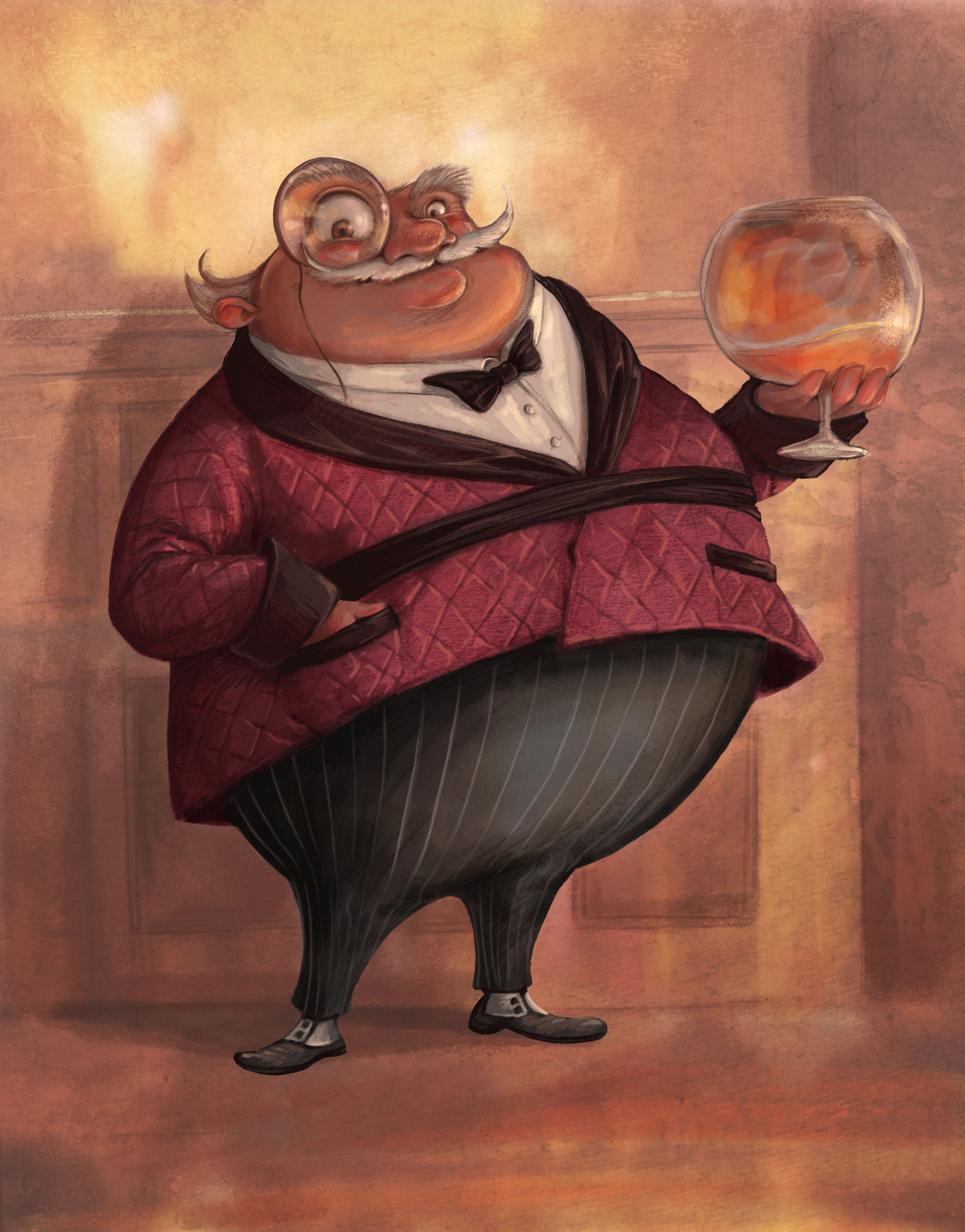
So, the first assignment was to create Walter Chipwitther, a jolly entrepreneur in his late 60s, who wears a smoking jacket and monocle. Here were my first attempts:


I decided I liked the guy with the brandy balloon best, so then I reworked him a little to try and improve his structure and exaggerate his features.
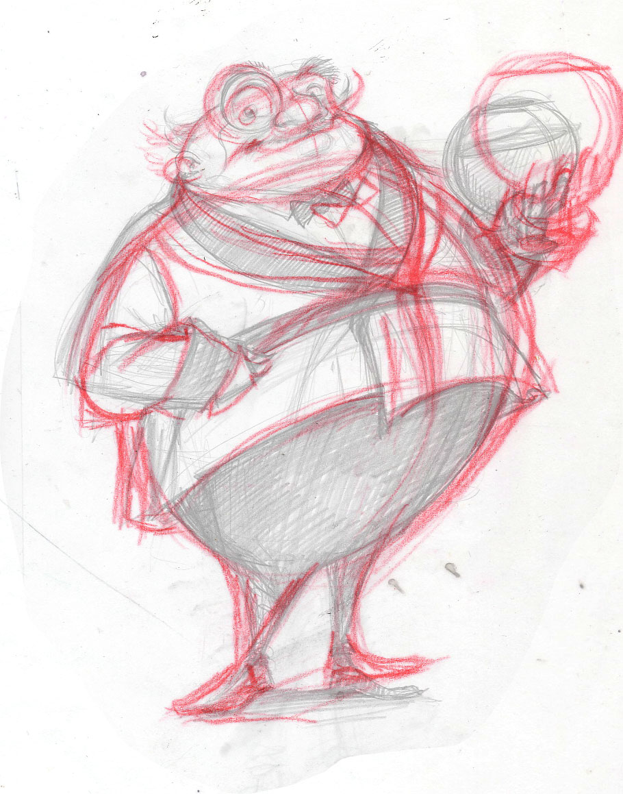
I think I could have been a bit braver with the design and style, but hey, it's my first attempt! The plan is to actually learn stuff and get better.... (fingers crossed.) So then I did a more developed pencil sketch, based on his new, improved proportions.

And then - the colour! This was done in Photoshop with some of Kyle's fabulous brushes. One of the things I'm learning is that it's important for characters to have an interesting and dynamic silhouette... well, he's definitely very rotund.